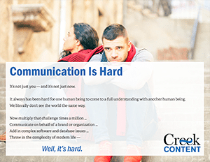
But the things we learned doing it were good reminders to us — what we’ve been telling our clients for years is still right on target. Here are just a few lessons learned:
- The audience is key. One of the people who looked at a draft of our piece said, it looks great, but I’m not sure what all these things mean. Good news — he didn’t fit our audience profile. It’s important if our audience understands, and it’s important that we know who our audience is!
- More eyes are better, up to a point. We’re pretty good editors around here, if we do say so ourselves. But the first two people we asked to look at this piece asked us good questions about word choice and punctuation that we hadn’t considered before. If your publications matter to you, and you want to look professional, you need more than one set of eyes on everything. You need multiple eyes on the really important stuff. We don’t advocate design or copywriting by committee, but we know from experience how much good editors matter.
- Design content and images to tell the message together. We mostly knew what we were looking for with the imagery on this piece, but we went through some different options on a couple of pages. We had some serious discussions on what the image should achieve, and on whether it did its job or not. Some of these we got right the first time around. That’s our third shot at page 2, though, and we’re finally happy with it.
Now then, if you work in marketing or product development and you need help figuring out how content can help you achieve your goals, we’ve got a piece we designed just for you. And we’d love to talk more when you’re ready.
